Percepto Studios
  • WORK
  • REELS
  • SERVICES
  • CONTACT
Select Page

Social Butterflies

Simply Luscious | RTD Beverage

Creating brand story around a calorie conscious cocktail

Conscious cocktails

Branding // Identity // Logo // Package Design // Product Design // Web Layout

THE CHALLENGE

Low calorie wasn’t enough. The RTD cocktail space is crowded with functional messaging—low sugar, low calorie, “less bad” for you. But function alone doesn’t build brands. This needed to be something more: A product people didn’t just drink—but identified with.

THE APPROACH

The concept centered around transformation—in a health conscious way and how that translates socially.

“Social butterfly” became more than a metaphor. It became the brand–Light–Effortless–Attractive–Socially fluid. The product wasn’t just a drink. It was a version of you.

THE RESULT

A brand mark with purpose, built to be seen—and chosen.

Simply Luscious moved beyond functional beverage branding into something more emotional, expressive, and ownable.

A product with personality. A brand with presence.

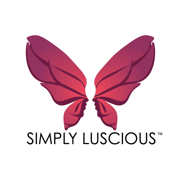
Brand Logo for Simply Luscious, a butterfly wings with faces in the center, in the negative space a cocktail glass illusion

Logo design

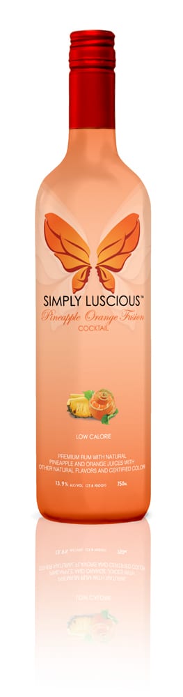
Bottle Desing for Pineapple Orange Cocktail
Bottle Design for Passion Fruit
Passion Fruit Logo of butterfly illusion with two faces making a cocktail glass in the negative space
Logo breakdown showing the butterfly paired with two opposite faces looking at each other in the center creating a cocktail glass in negative space
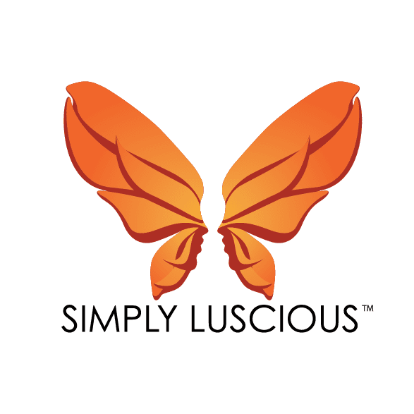
Orange Simply Luscious butterfly logo
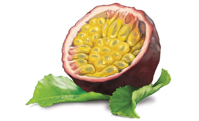
Passion fruit artwork, the fruit is split open showing seeds, sitting on top of leaves
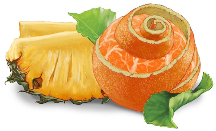
Artwork for Pineapple Orange flavor, the orange is unwrapping it's peel with juicy pineapple behind it
Percepto simply luscious page break design with butterfly in center and decorative border
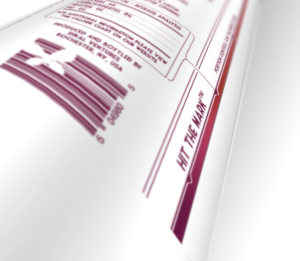
Bottle desing mockup showcasing the inventive calorie serving markings on the alcohol bottle

HIT THE MARK™

This was the product differentiator. The bottle was designed with marked calorie / servings for the conscious consumer.

Process Notes

DEVELOPMENT: TAKE 1

Early exploration leaned illustrative and expressive—pushing femininity, flavor, and personality.

Through iteration, the system was refined into something more iconic:

  • Cleaner
  • More scalable
  • More ownable

The final direction balanced beauty with clarity—designed to work across packaging, digital, and brand extensions.
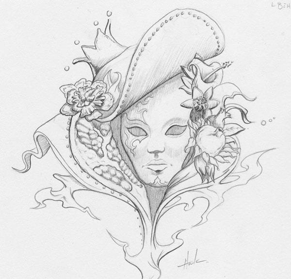
Percepto sketch of a Masquerade and collar made of poegranate
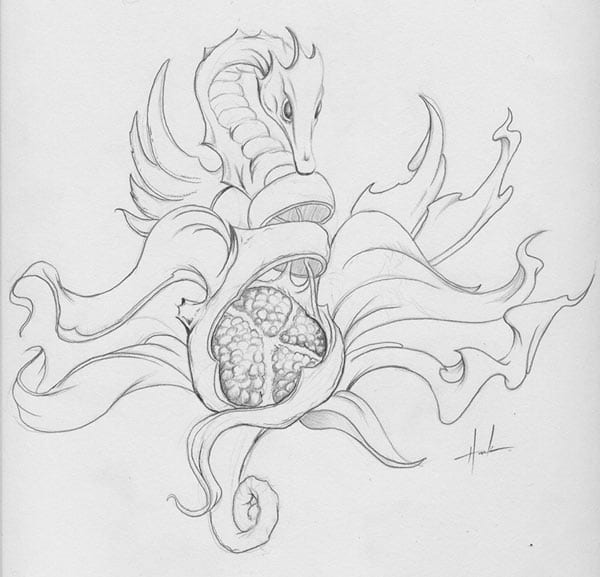
A sketch of a seahorse-like dragon unraveling around a pomegranate
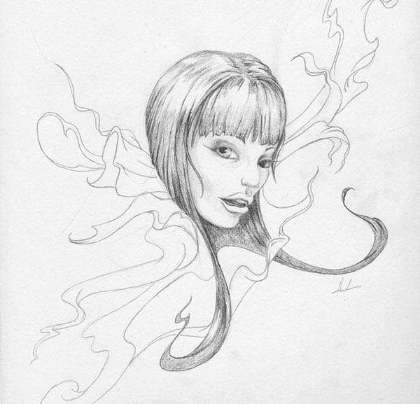
Female with swirling hair with flowy ribbons sketch
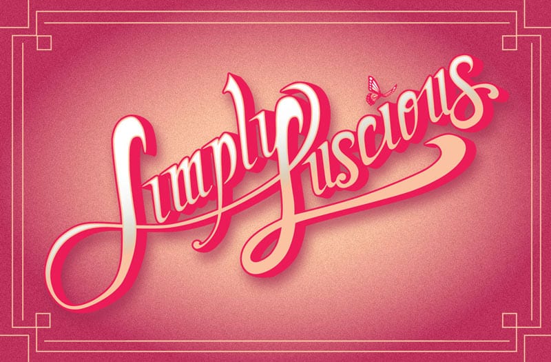
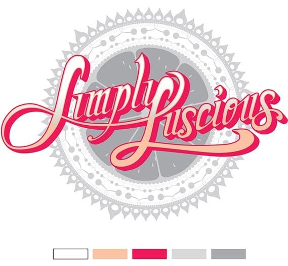
Simply luscious Logo full treatment with soft warm hues, cursive script and a butterfly over the "i" soft
Percepto Simply Luscious Logo over a lace design made of citrus, cherries and other fruit
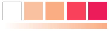
Brand colors from white, tans and soft pomegranate hues
Percepto Simply Luscious typeface - sample letters

Pineapple Orange Fusion // Pomegranate // Passion Fruit Medley
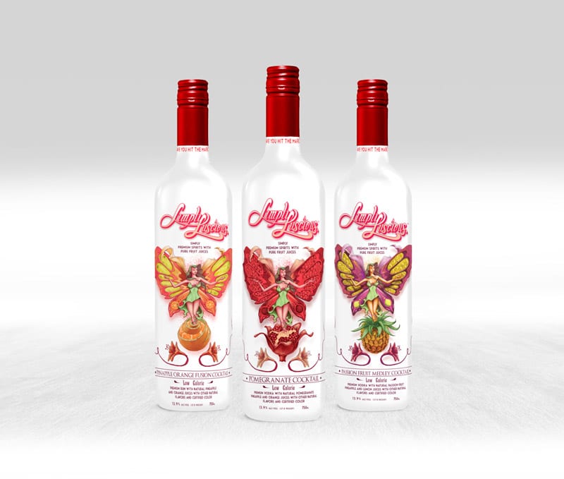
Percepto simply luscious bottle art, all 3 flavors- each with a woman butterfly made up of fruit
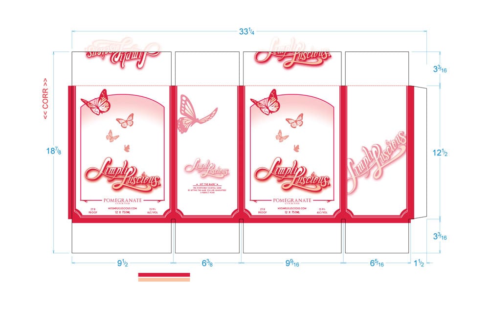
Percepto simply luscious case package layout
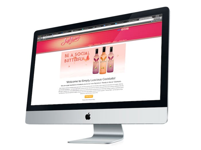
Percepto Simply Luscious website shown on an iMac, the flavor bottles are show predominantly
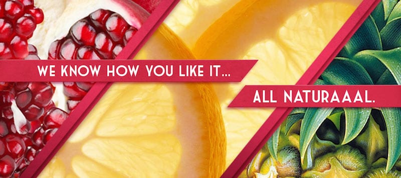
simply luscious website banner with pomegranate, citrus, pineapple
← BACK Next →
LET'S MAKE IT HAPPEN
  • WORK
  • REELS
  • SERVICES
  • CONTACT
  • Facebook
  • Instagram
© 2026 Percepto Studios. All rights reserved.